How I created a brand identity for a clean & ethical cosmetic brand
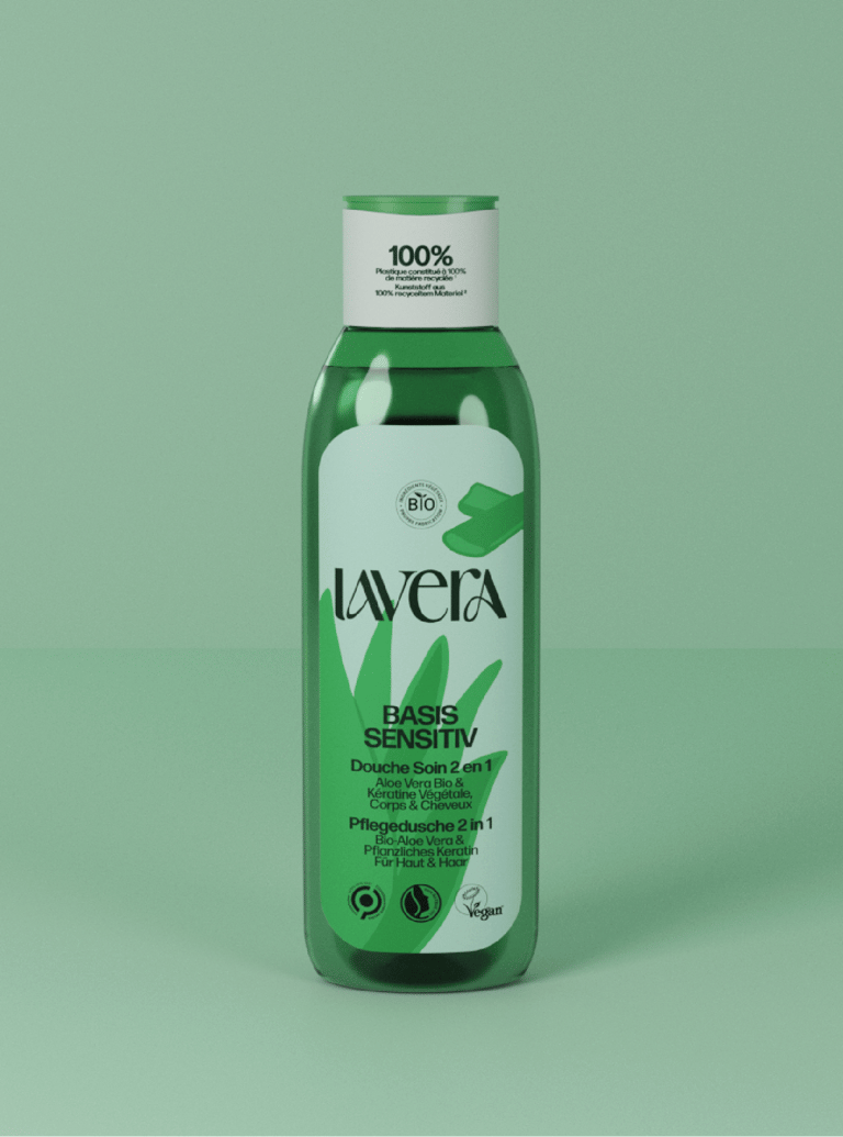
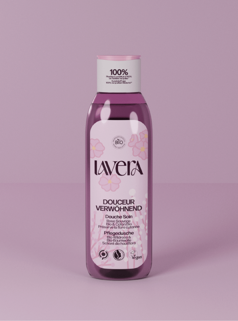
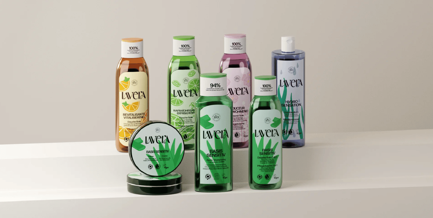
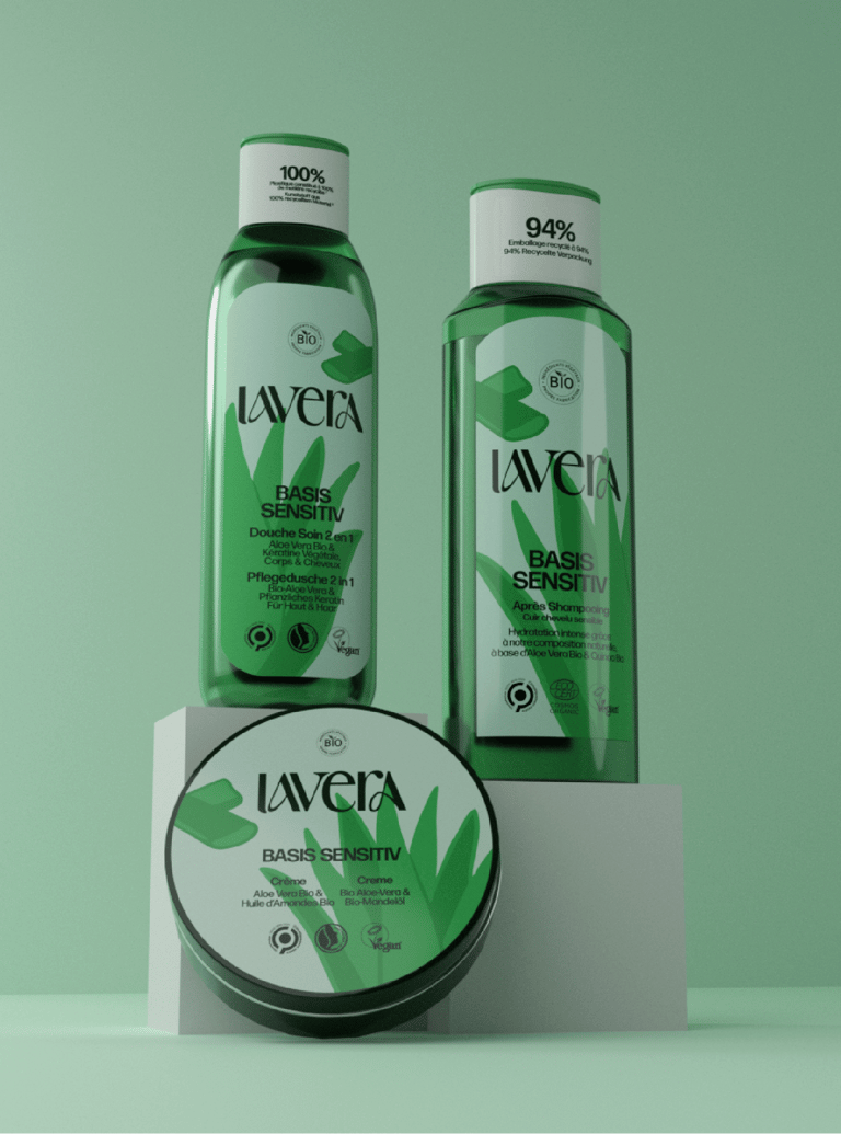
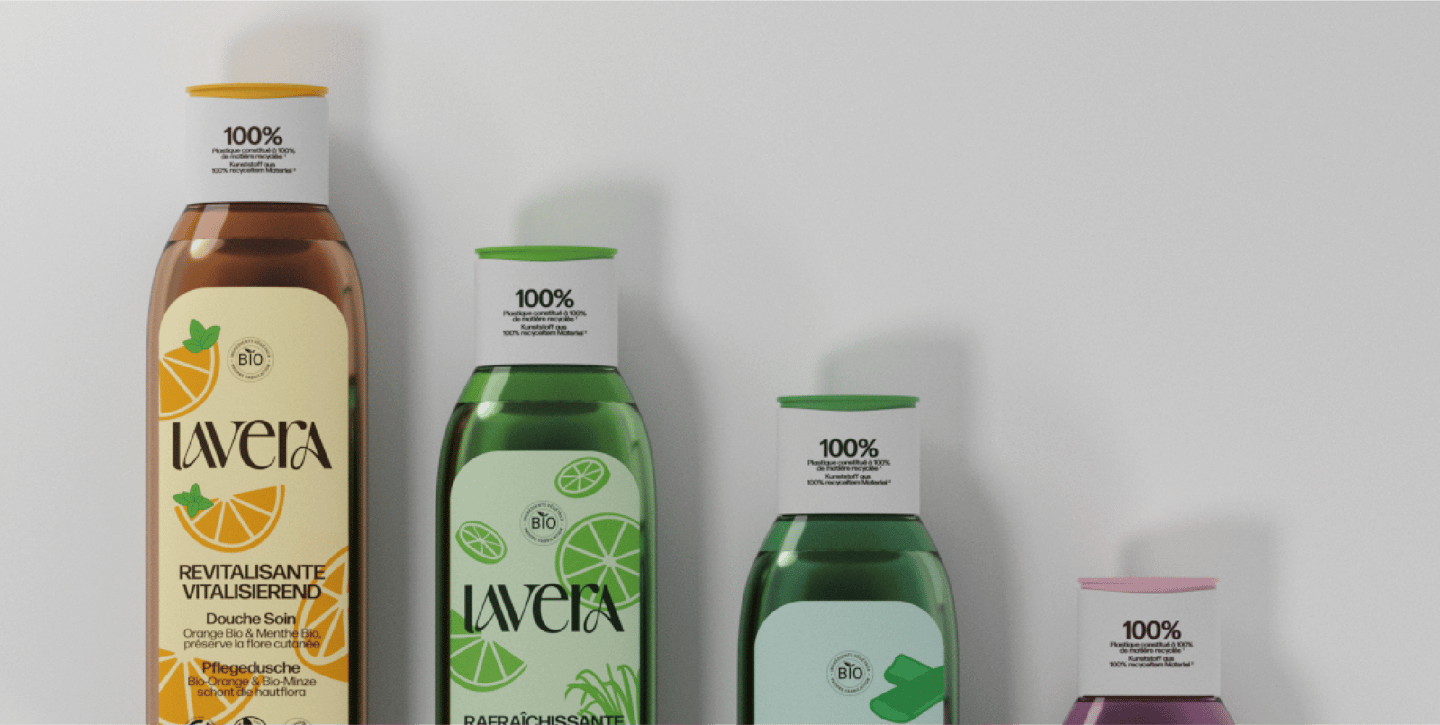
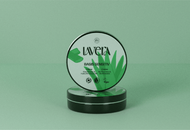
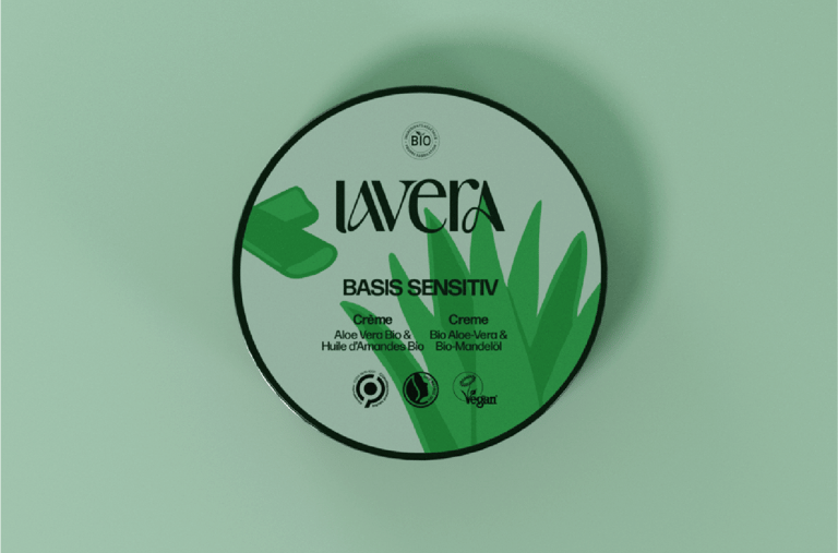
Lavera is a german brand that specializes in natural cosmetics. While having many quality products, the brand struggles to find a consistent and attractive image, especially in its packagings and website. I centered my strategy around the ingredients, a significant feature of the brand's essence.
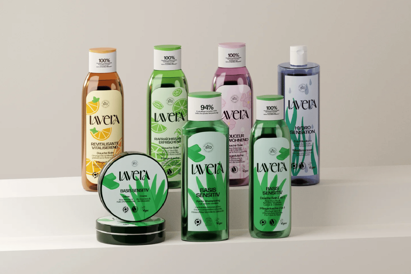
This was the final project for my Bachelor's Degree in Art Direction. We had to create a new, coherent Artistic Direction for lavera, which makes organic and natural cosmetics. The challenge was to improve and standardize lavera’s visuals and packagings. Lavera wanted to be easily identified as an organic brand.
Background
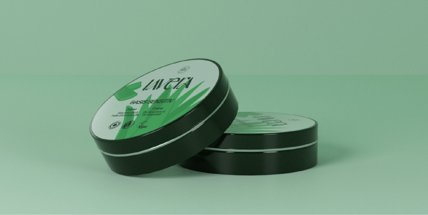

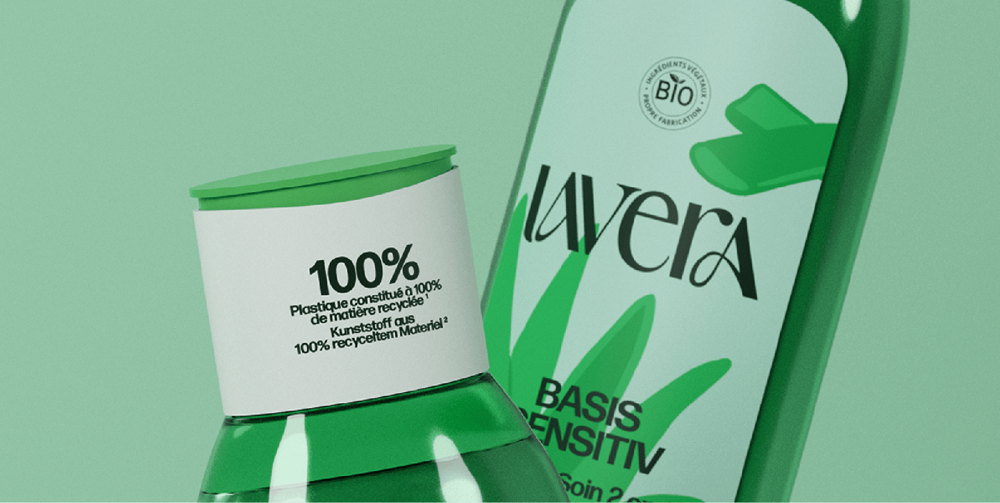

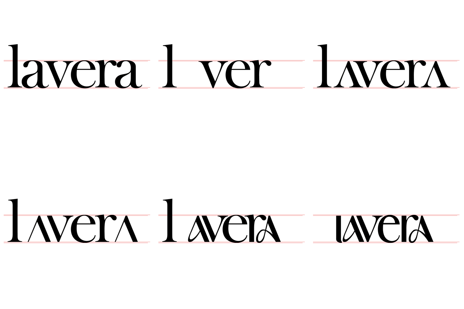
What makes this project my most accomplished yet is the consistent research that put down the base. As the project was to graduate, I had to showcase a wide range of skills. I presented a study of lavera, its competitors, the market, and the target audience. In order to do that, I created benchmarks, mappings and user questionnaires—which are all displayed here. The logotype is inspired by the "Art Nouveau" movement, which includes many curves that remind us of plants and nature. It coincides with the new visual identity since organic and natural ingredients are a priority for lavera.
Challenge

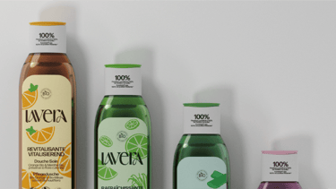
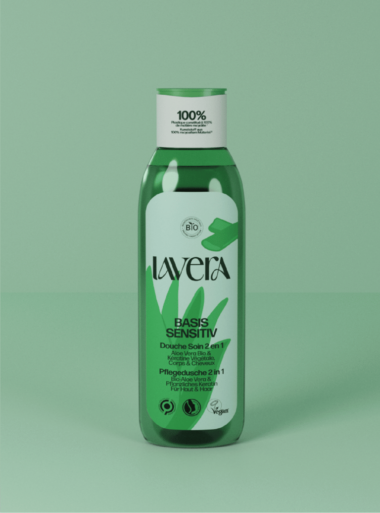
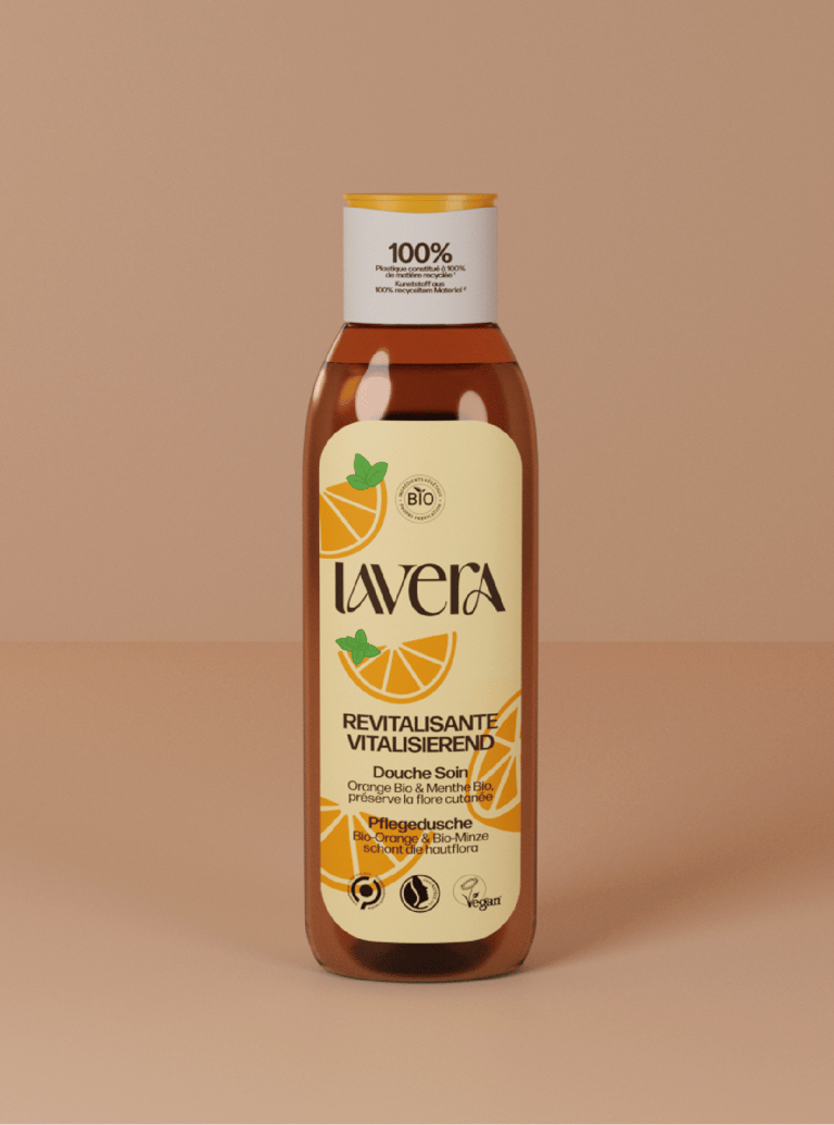
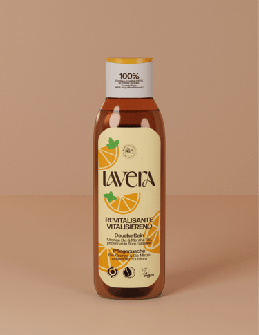
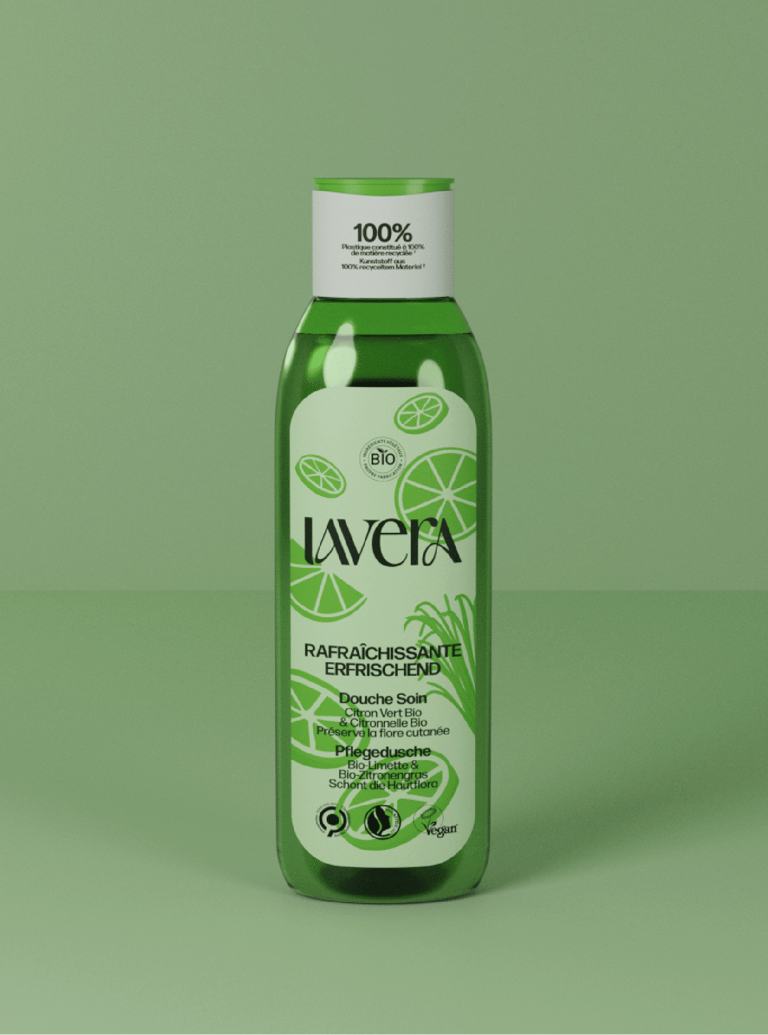
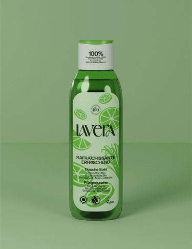
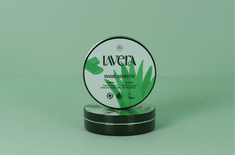

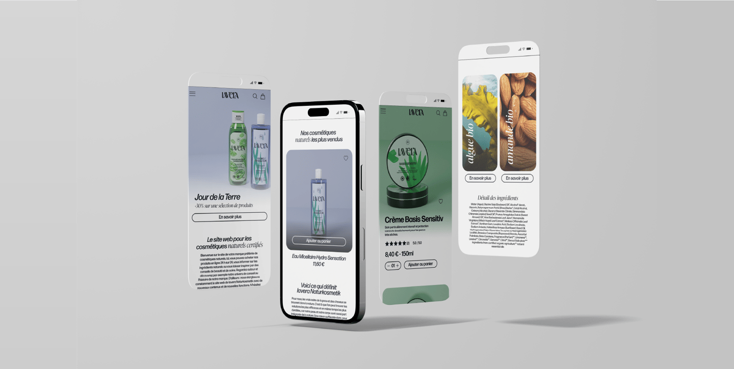
I applied the new artistic direction to their website. My main focus was improving the clearness and readability. Following my strategy, I focused on the ingredients. Every background color on the website represents the main natural ingredient used. For instance, the product page for an aloe vera balm has a green background–green for aloe vera. I applied my vision in the details too. I used Art Nouveau-inspired curves on the web and rounded corners for the product cards and pictures. These small details make tie together my concept and set it apart.
Website
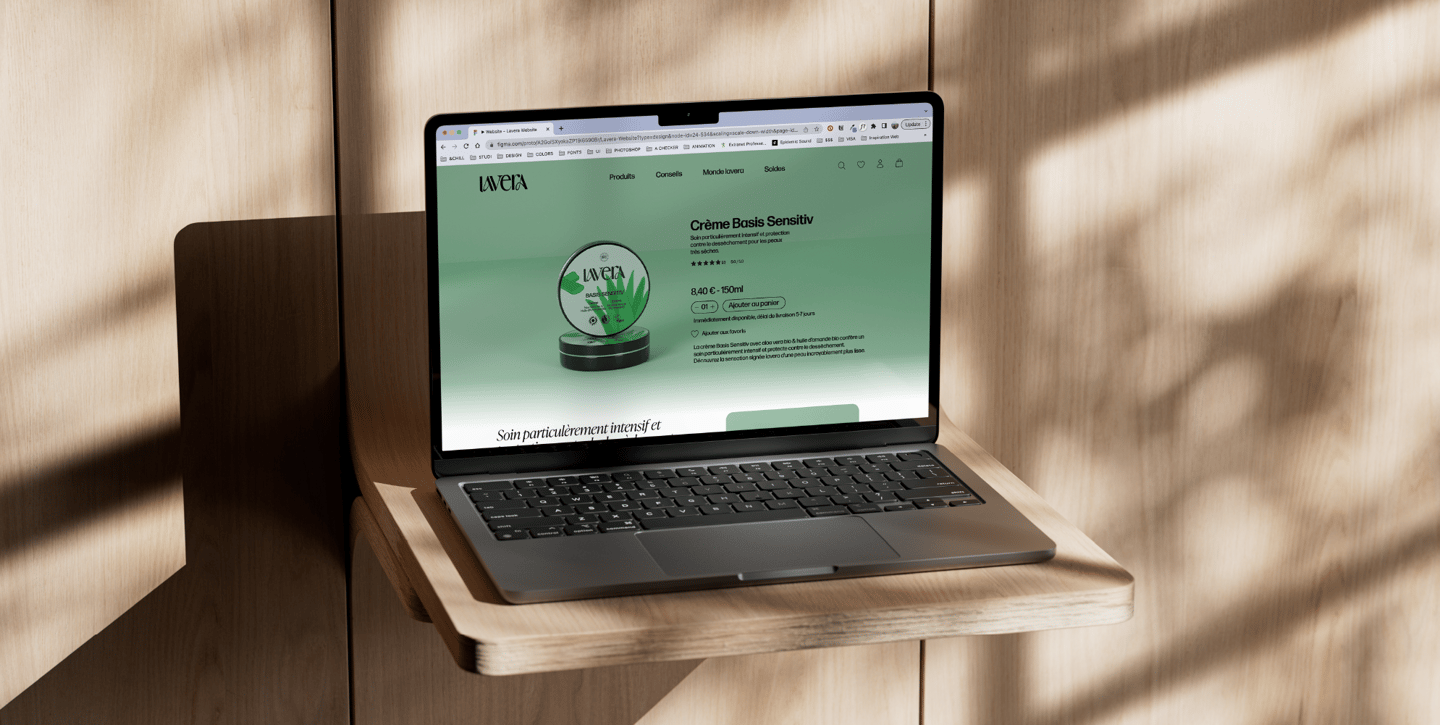
Overall, I succeeded in bringing a new vision to lavera. I broke away from the regular and the not-so-special packagings and website to give the brand life. The focus was to keep the essence and make lavera easier to understand.
Conclusion
