I created the coolest coffee spot in New York City
In passion projects, there is no client and I had to give myself that role. It is not easy to chose a direction and stick to it. I wanted the visual identity to be welcoming, authentic and simple so that customers feel at home. Brews and Bites should feel like a premium coffee shop, but accessible to all and affordable.


In passion projects, there is no client and I had to give myself that role. It is not easy to chose a direction and stick to it. I wanted the visual identity to be welcoming, authentic and simple so that customers feel at home. Brews and Bites should feel like a premium coffee shop, but accessible to all and affordable.
Background
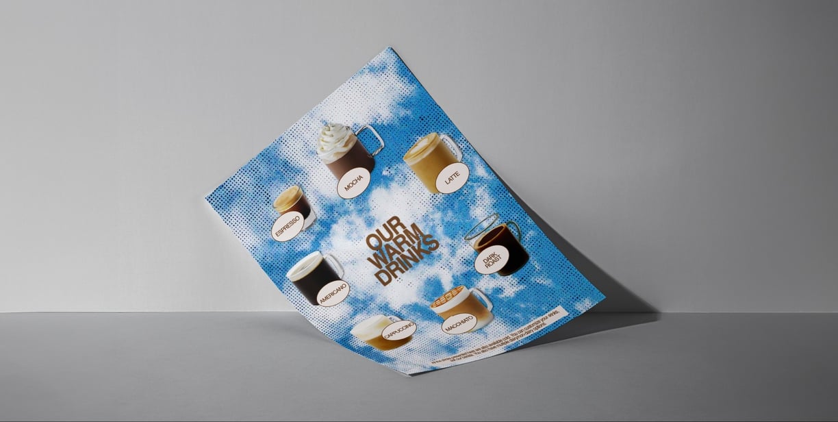
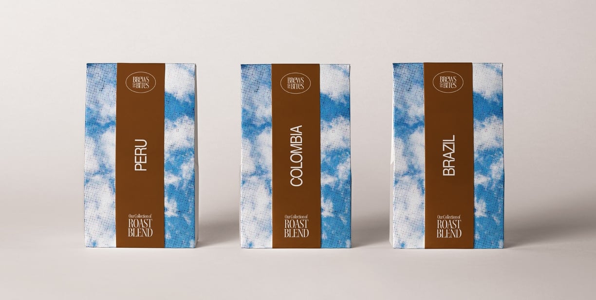
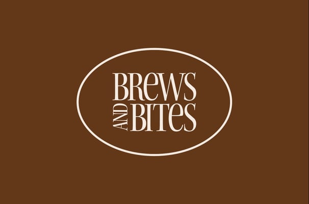
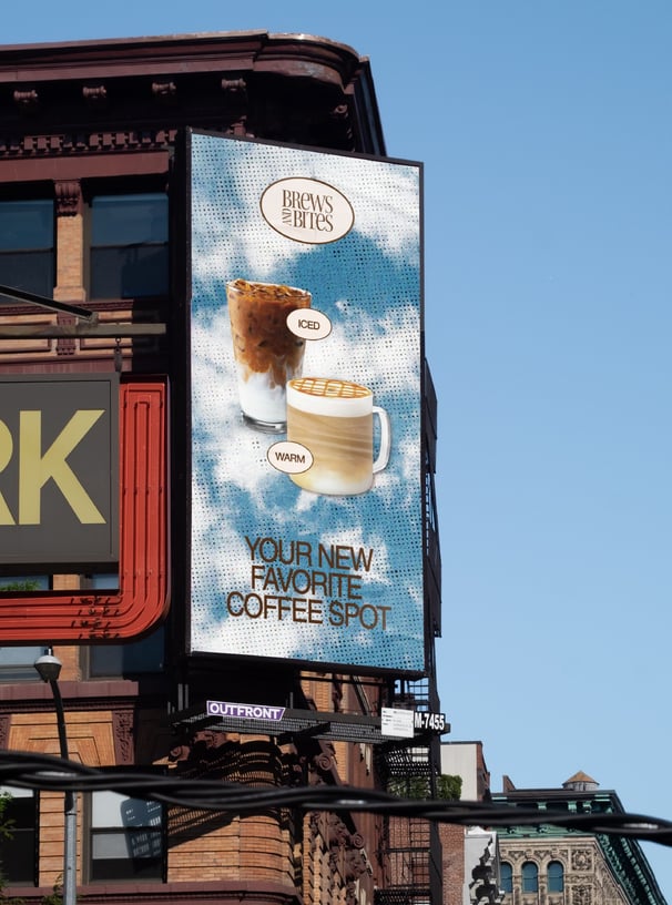
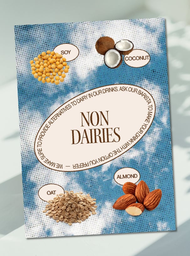
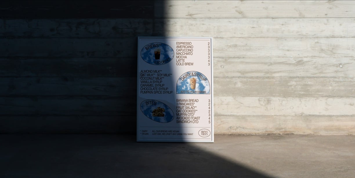
I decided to base my concept around 3 pillars. Along with the combinaison of a brown tone and an off-white, I used a textured picture of a blue sky with clouds. This allowed me to bring diversity while keeping a restricted color palette. The sky represents freedom, nature and brings a feeling of relaxation. I also used 3 defined shapes across Brews and Bites' communication. These allow for coherent and easy to read layouts, and one of them is found in the logotype, circling the name of the shop. Finally, I used detoured pictures of the drinks crafted by the baristas.
Concept
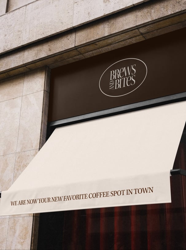
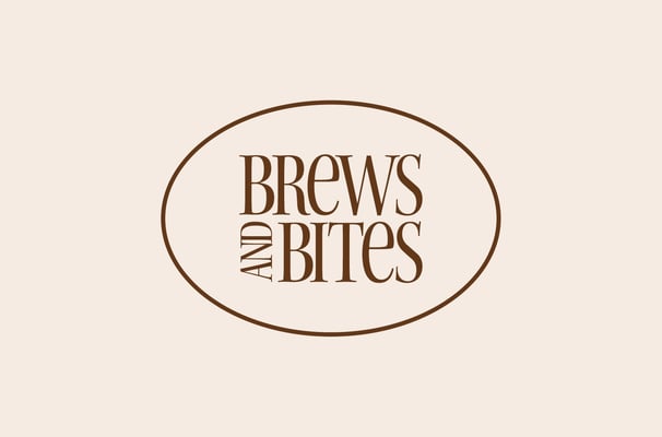
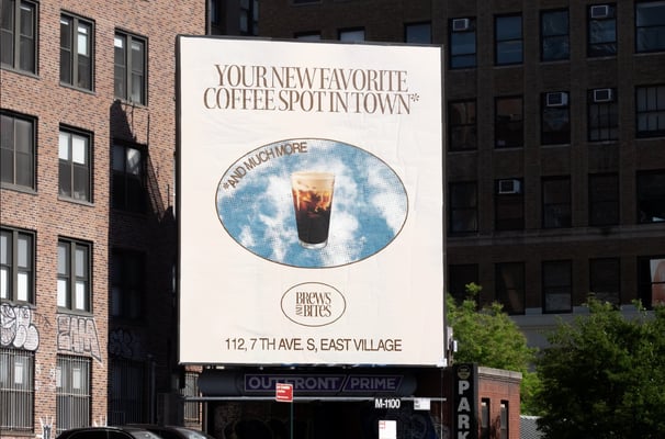
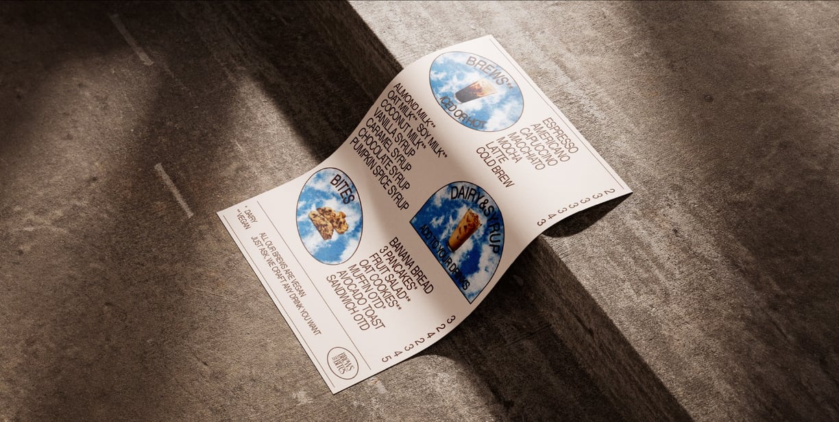
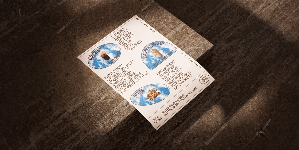
As mentioned earlier, we can find the 3 shapes on almost every layout. It allowed me to have recurring elements, and a recurring layout by placing the shape in the middle of the document. I use a combination of a two condensed fonts : Kepler Std and Nimbus Sans that work really well together.
Brand elements
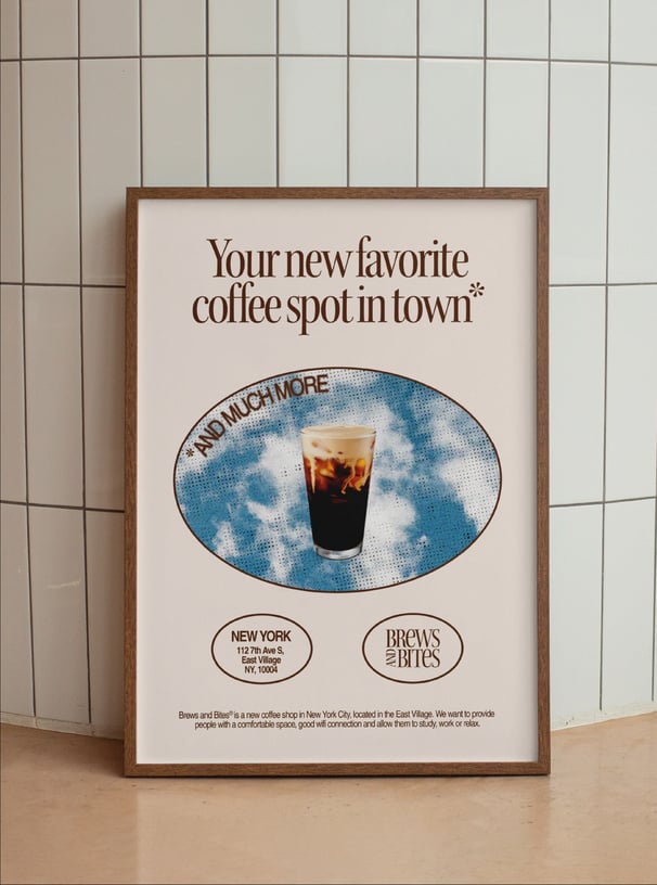
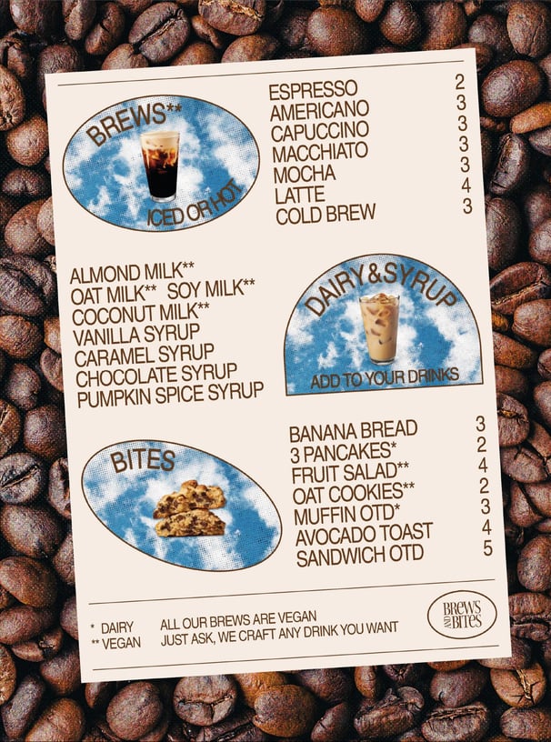
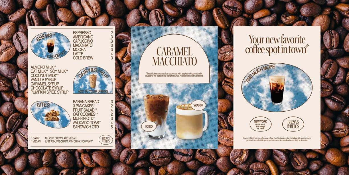
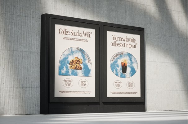
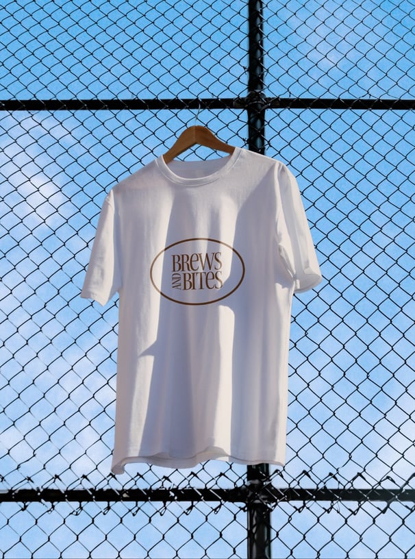
The brand identity created for Brews and Bites reflects exactly the idea of this coffee spot. Using only a few brand elements allow for a coherent and simple communication, whether it is for print or digital documents.
Conclusion
SEE OTHER PROJECTS
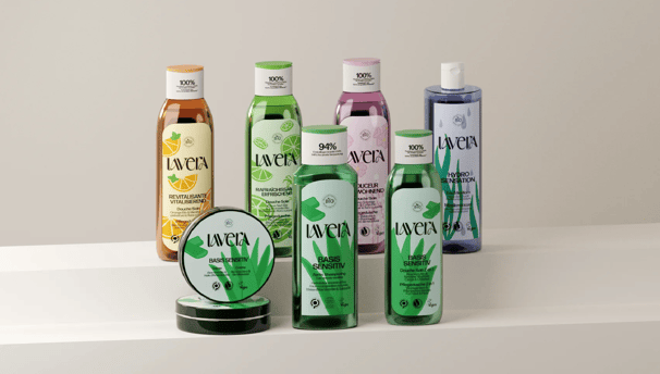
Lavera is a german brand that specializes in natural cosmetics. While having many quality products, the brand struggles to find a consistent and attractive image, especially in its packagings and website. I centered my strategy around the ingredients, a significant feature of the brand's essence.
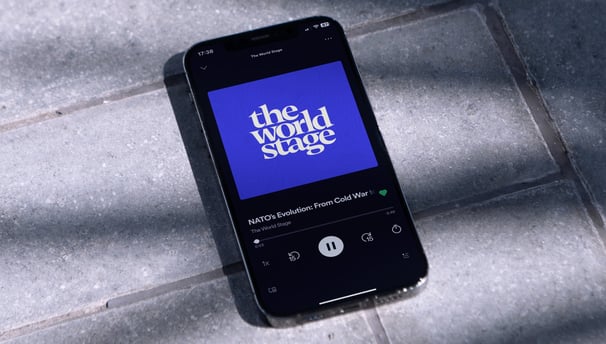
For the fictional podcast "The World Stage," I designed a distinctive brand identity, including logos and episode graphics. I also created engaging social media content to effectively promote the podcast and engage its audience.
ART DIRECTION, BRAND STRATEGY, BRAND IDENTITY
ART DIRECTION, BRAND IDENTITY

